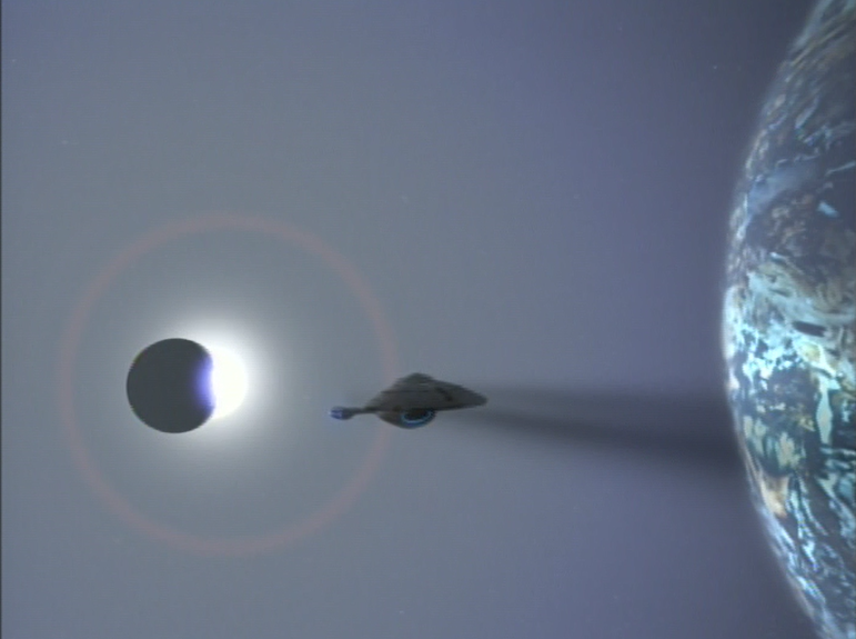
Whether Star Trek: Voyager (1995 - 2001) is your favorite entry in the long-lived space opera franchise or not, it is pretty much undeniable that the series' introductory montage is the most beautiful and gorgeously realized in Trek history.
The original Star Trek (1966 - 1969) remains my overall favorite series in the Roddenberry universe for many reasons, but in this terrain, it simply doesn't compete. If you go back and watch the opening credits for Star Trek, even with high-definition special effects, you can see that it doesn't quite capture the majesty, mystery or wonder of space.
At least not in the way that Voyager's opening manages. Indeed, I have readers asked me to feature a Star Trek series here on Outre Intro, and I have resisted for a variety of reasons.
DS9's (1993 - 1999) opening is sedentary and dull, even though the series itself is great.
I never took to Enterprise's (2001 - 2005) non-traditional theme song.
And The Next Generation (1987 - 1994) got close...but Voyager perfected the "space art" formula, revealing deep space as a realm you would actually want to explore.
Specifically, Voyager recognizes a fact that Space:1999 (1975 - 1977) learned in the seventies: outer space looks a lot cooler when you're not looking at it simply a black background with pinpricks of light. A colorful nebula helps break the visual monotony.
Accordingly, in Voyager, space is a living place of fire and ice, of fog and shadows. In short, it looks like a place you might actually want to spend money to visit.
This is not a small deal.
By the 1990s, the American space program had become "routine," taken for granted by most citizens. The shuttle program was aging, but one bright spot (after initial problems...) was the Hubble Telescope, which revealed some of the most beautiful cosmic imagery one could imagine. Voyager's introductory montage seems to have been created with this ideal in mind, forsaking the traditional image of outer space as nothing but blackness and snowflake stars.
As the montage commences, cosmic rays are visible, stretching across a section of space. The light and particles are golden, suggestive of heat, but sort of a welcoming heat, in a sense. In the next frame, we see that these are emissions from a bright star, and a lone starship passes within our view.
We move through the wave of particles, and when they dissipate, disappearing from view, the series title comes up.
Importantly, the lettering of the word VOYAGER is gold too, exactly like the light we saw from the sun.
Next up, the great starship passes by our eyes. It moves above us, so that we get a good, detailed look at it. It is familiar, like the U.S.S. Enterprise, in shape, but different too.
Instead of a saucer, we get an arrow head, or spear point. That seems appropriate for a ship blazing new trails, in unexplored space.
Next up, the Voyager cuts through what looks like a glowing fog-bank in space, and we get only intermittent views of her, as we might get similar views of a submarine at sea, moving just beneath the ocean's surface.
Next, an asteroid tumbles through view, and there is, perhaps, a cosmic string in the background, letting off white light.
A planet surface becomes visible, and in the foreground an icy, mountainous moon. Once more, the array of sights is dazzling and beautiful, and a repudiation of the idea that space is a barren, empty place, devoid of light and life, devoid of beauty.
The message: this is an exciting show worth watching, and space is a realm worthy of exploration.
Another gorgeous sight: we move through the rocks comprising the rings of an alien world.
I love this next sequence of shots, as it suggests one reason to love film (and television). Both media, at their best, can take us to places we have never been, but perhaps imagined in our dreams. This shot, moving through the rings of a Saturn-like planet, at least for me, fulfills that idea.
A color inversion is next, as Voyager moves beyond an eclipse of some type. Again, the montage seems to stress color and a variety of environments. This shot looks like "negative" space, and like nothing we would expect to encounter.
In the montage's final sequence of shots, Voyager warps into a nebula, into -- importantly -- a zone of light, and varied colors (crimson and blue). It's destination is not a world of black and white, but wondrous color. This is what awaits us in the stars if we are brave enough to tackle them.
I absolutely love the visuals of this montage, and how they are coupled with Jerry Goldsmith's remarkable, inspiring and bombastic score.


